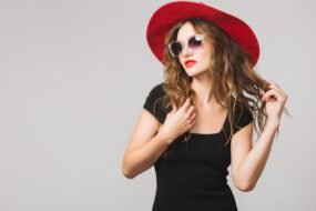

Color is one of the most powerful tools in fashion. It’s not just about aesthetics — the colors you wear can impact how you feel, how others perceive you, and how well your features are complemented. Understanding color theory and how it applies to fashion is essential for creating a wardrobe that flatters your unique complexion, enhances your confidence, and expresses your personal style. In this guide, we’ll dive deep into color theory in fashion and how to use it to choose the perfect palette for you.
The Basics of Color Theory
Before we get into fashion specifics, it’s important to understand the fundamentals of color theory. At its core, color theory is a set of principles used to create harmonious color combinations. It originates from the color wheel, a visual representation of colors arranged according to their chromatic relationship.
The Color Wheel
The traditional color wheel consists of:
- Primary colors: Red, blue, and yellow — these cannot be made by mixing other colors.
- Secondary colors: Orange, green, and purple — made by mixing two primary colors.
- Tertiary colors: Made by mixing a primary color with a neighboring secondary color (e.g., red-orange, blue-green).
Color Harmonies
These are pleasing combinations derived from the color wheel:
- Complementary colors: Opposite each other on the wheel (e.g., blue and orange). High contrast and bold.
- Analogous colors: Next to each other on the wheel (e.g., blue, blue-green, green). Calming and cohesive.
- Triadic colors: Evenly spaced around the wheel (e.g., red, yellow, blue). Vibrant and balanced.
- Monochromatic: Variations in lightness and saturation of a single color. Sophisticated and subtle.
Now, how do these harmonies play out in fashion? They guide outfit coordination and ensure your look feels balanced, intentional, and stylish.
Color and Personal Style
Fashion is a form of self-expression, and color is one of its loudest voices. The colors you gravitate toward can say a lot about your personality, mood, and aesthetic preferences.
Here’s a quick breakdown of how color reflects different style archetypes:
- Minimalist: Neutrals (white, black, gray, beige), monochromatic palettes.
- Bold/Edgy: High contrast, saturated hues, metallics.
- Romantic: Soft pastels, blush tones, creams.
- Bohemian: Earth tones, warm hues, rich patterns.
- Classic: Navy, burgundy, crisp white, camel.
Start by identifying your style personality and the mood you want to convey. Then you can narrow down the colors that naturally align with your aesthetic.
Discovering Your Undertone
The key to choosing colors that truly flatter you lies in understanding your undertone. This refers to the subtle hue underneath the surface of your skin — not to be confused with your actual skin color (which can be fair, medium, or dark).
There are three main undertone categories:
1. Cool Undertone
- Hints of blue, pink, or red beneath the skin.
- Veins appear blue or purple.
- Silver jewelry flatters more than gold.
- Skin burns easily in the sun.
Best colors: Cool-toned shades like emerald green, sapphire blue, lavender, cool grays, and icy pastels.
2. Warm Undertone
- Yellow, peachy, or golden undertones.
- Veins appear green.
- Gold jewelry looks more flattering.
- Skin tans easily.
Best colors: Warm hues like coral, amber, olive, mustard, and earthy browns.
3. Neutral Undertone
- A mix of cool and warm.
- Veins are blue-green.
- Both gold and silver jewelry look good.
- Skin may tan slowly but not burn easily.
Best colors: Muted versions of most colors; think jade green, blush pink, soft white, or dusty rose.
You can determine your undertone using various at-home tests — looking at your veins, holding white paper next to your face, or comparing how you look in gold versus silver jewelry.
Seasonal Color Analysis
Seasonal color analysis is a popular framework that groups individuals into four seasons — Spring, Summer, Autumn, and Winter — based on their hair, eye, and skin color, and corresponding undertones.
Spring
- Warm undertones
- Light eyes (blue, green, hazel)
- Hair: golden blonde, strawberry blonde, light auburn
Best colors: Peach, camel, golden yellow, turquoise, warm pastels.
Summer
- Cool undertones
- Light eyes (gray, blue)
- Hair: ash blonde, soft brown, light brown
Best colors: Powder blue, rose pink, lavender, cool grays, soft white.
Autumn
- Warm undertones
- Eyes: hazel, brown, green
- Hair: red, chestnut, golden brown
Best colors: Rust, mustard, olive, chocolate, burnt orange.
Winter
- Cool undertones
- Eyes: dark brown, icy blue, gray
- Hair: black, dark brown, cool blonde
Best colors: Jewel tones (ruby, sapphire), stark black and white, charcoal, cobalt.
Building a Color Palette That Works for You
Once you’ve determined your undertone and seasonal category, it’s time to build a cohesive color palette for your wardrobe. A good palette should be both flattering and functional — allowing you to mix and match effortlessly.
Here’s how to structure your color palette:
1. Neutrals
These are your wardrobe’s foundation. Choose 2–3 neutral colors that match your undertone and personal style.
- Cool neutrals: Charcoal, navy, cool beige, soft white
- Warm neutrals: Camel, cream, olive, taupe
2. Core Colors
These are the colors you wear most often. They reflect your personality and should be flattering for your skin tone.
Choose 3–5 core colors that harmonize with your neutrals.
3. Accent Colors
Use these for fun and statement pieces — shoes, bags, scarves, or makeup. Pick 2–4 colors that bring energy or contrast.
This structured approach not only makes shopping easier but also helps you create outfits with a consistent, polished look.
Using Color Psychology in Fashion
Color doesn’t just influence how you look — it affects how you feel and how others respond to you. Here’s a breakdown of common colors and their psychological impact:
- Red: Power, passion, energy — perfect for a statement piece or date night.
- Blue: Trust, calm, stability — ideal for interviews or corporate settings.
- Yellow: Optimism, warmth, happiness — great for casual or summer wear.
- Green: Balance, nature, freshness — works well in professional or boho styles.
- Purple: Royalty, creativity, luxury — adds a mysterious, artistic vibe.
- Black: Sophistication, authority, elegance — a staple in every wardrobe.
- White: Purity, simplicity, freshness — great for minimal and clean looks.
- Pink: Romance, softness, youth — often used in feminine or playful styles.
Use this to your advantage by selecting colors based on the mood or message you want to convey.
Tips for Mixing and Matching Colors
Worried about clashing? Here are some tried-and-true tips to help you mix colors like a pro:
- Use the 60-30-10 rule:
- 60% of the outfit should be your dominant color (usually a neutral).
- 30% should be a secondary color.
- 10% should be an accent or statement color.
- Stick to analogous colors:
- Choose colors next to each other on the wheel for a harmonious look.
- Balance warm and cool tones:
- Don’t pair warm with cool unless it’s intentional (like red and teal or mustard and navy).
- Don’t forget texture:
- Mixing textures (knit, denim, silk) can elevate a monochromatic or minimalist palette.
- Limit bold colors in one outfit:
- Let one bold piece shine, and keep the rest grounded.
Adapting Your Palette for the Seasons
Fashion changes with the seasons, and so should your color palette. That doesn’t mean tossing your wardrobe every three months — just rotate in seasonal tones that align with your overall palette.
- Spring: Add peach, mint, soft yellow, coral.
- Summer: Embrace baby blue, blush, white, sky gray.
- Autumn: Lean into rust, moss green, burnt sienna, plum.
- Winter: Use deep jewel tones, icy pastels, stark black and white.
This keeps your wardrobe feeling fresh and in tune with the natural environment.
Experimenting with Color in a Safe Way
If you’re unsure about diving into bold color choices, start small:
- Accessories: Try a colorful bag, scarf, or pair of shoes.
- Makeup: Experiment with lip colors, blush, or nail polish.
- Layering: Wear a bold color under a jacket or blazer.
- Prints and patterns: Choose prints that include your core colors to ease into combinations.
As your confidence grows, you’ll find it easier to incorporate color more boldly and authentically.
Color and Cultural Significance
Color also carries cultural meanings. Red may symbolize luck in Chinese culture, mourning in some South African traditions, and love in Western societies. When traveling or dressing for multicultural events, it’s helpful to be aware of color connotations in different regions.
This adds another layer of depth and sensitivity to your fashion choices — color becomes not just personal, but cultural and even global.
Final Thoughts
Color theory in fashion is both an art and a science. With a little exploration into your undertone, personal style, and seasonal palette, you can unlock a wardrobe that feels custom-made for you. The right colors can enhance your natural features, boost your confidence, and bring joy to getting dressed every day.
Whether you stick to neutral classics or love to play with bold hues, understanding how color works allows you to make more intentional, flattering, and expressive style choices.
So go ahead — open your closet, grab a mirror, and start playing with color. The perfect palette for you is already within reach.
Recent Post


Gallery