As the saying goes, “a picture is worth a thousand words.” In the world of blogging and website design, this couldn’t be more true. Visual hierarchy plays a crucial role in guiding your readers’ attention and communicating information effectively through design. Whether you’re just starting out with your blog or looking to revamp its layout, understanding visual hierarchy can take your design skills to new heights and improve user experience for your readers. In this post, we’ll explore what visual hierarchy is, how it can be used in designing blogs, its benefits, and examples of good visual hierarchy in action. So buckle up and get ready to elevate your blog’s design game!
Defining Visual Hierarchy
Visual hierarchy is the arrangement of visual elements in a design to guide a viewer’s attention. It involves creating a sense of order and importance by using size, color, contrast, spacing, and other design principles. The goal is to create an organized layout that helps viewers easily navigate through information.
In blog design specifically, visual hierarchy can help communicate the purpose of your post quickly and effectively. This means it should be clear which parts are headlines or subheadings, which parts are text blocks or paragraphs, and what each section refers to.
One way to achieve this organization is by using typography. Headlines should be larger than body copy while also being differentiated with bold or italic font styles. Additionally, paragraph breaks can give readers rest from walls-of-text while also making content more skimmable.
Color choice plays another significant role in establishing a strong visual hierarchy – especially when you’re trying to emphasize specific points or ideas within your writing. For example, placing call-to-action buttons (CTAs) in red will draw more attention as opposed to placing them in muted colors like gray.
Overall – understanding how design choices affect user interaction goes hand-in-hand with effective communication strategies for bloggers!
How to Use Visual Hierarchy in Blog Design
When it comes to blog design, visual hierarchy is critical. It helps guide the reader’s eye and encourages them to engage with your content. Here are some tips on how to use visual hierarchy in your blog design:
1. Use color: Color is an excellent tool for creating a visually appealing layout that guides the reader’s eye through the page. Choose colors carefully and use them consistently throughout your site.
2. Typography matters: Select fonts that are easy to read and choose sizes based on importance of information. Remember, headlines should be larger than body text but smaller than subheadings.
3. Embrace whitespace: Whitespace can help you create contrast between different elements on your page, which can aid in guiding readers’ attention throughout the post.
4. Place important information first: The most essential information should come first, followed by supporting details or examples.
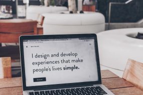
5. Use imagery: Images not only break up long blocks of text but also provide additional context and interest for readers when used strategically.
By using these tactics effectively, you can create a strong visual hierarchy in your blog design that engages readers from start to finish!
The Benefits of Visual Hierarchy
There are numerous benefits to incorporating visual hierarchy into your blog design. Firstly, it helps guide the readers’ eye and directs their attention towards the most important content on your page. This is particularly useful for blogs with multiple sections or pages, ensuring that readers do not miss any crucial information.
Visual hierarchy also aids in creating a more visually appealing layout which can entice and engage your audience. By establishing a clear structure and flow, you can make it easier for users to navigate through your site, leading to a better user experience.
Another benefit of implementing visual hierarchy is that it can help establish brand identity by allowing you to highlight certain elements such as logos or taglines. A consistent use of colors, fonts, and styles throughout will create a cohesive look that readers will associate with your brand.
Effective use of visual hierarchy can improve the overall readability of your blog by breaking up long paragraphs into smaller chunks with headings or subheadings. This makes it easier for users to scan through text quickly and find what they’re looking for without feeling overwhelmed by large blocks of text.
In summary, utilizing visual hierarchy in your blog design provides numerous advantages including improved navigation and readability while enhancing branding efforts and providing an overall better user experience for visitors to your site.
Examples of Good Visual Hierarchy in Blog Design
By incorporating visual hierarchy in your blog design, you can guide your readers through the content in a way that is both intuitive and engaging. Remember to use contrast, spacing, typography and color to create a clear visual flow that guides the reader’s attention from one element to another.
Here are some examples of blogs that have successfully achieved good visual hierarchy:
1. Smashing Magazine: This website uses color and typography effectively by using bright colors for headings and subheadings which makes it easier for readers to identify key information.
2. The Verge: Bold titles with plenty of white space make this website easy on the eyes while also guiding visitors towards important information they may be interested in reading.
3. HubSpot Blog: This blog has great use of whitespace within its design, making it easier for users’ eyes to rest between sections and read each piece of content more efficiently.
Mastering visual hierarchy is an essential skill if you want to improve user experience on your blog or website while increasing engagement levels with your audience. By following these tips outlined above and studying other successful blogs out there – you too can create designs that convey effective messaging without overwhelming or confusing viewers!